Edit In Place is a pattern where small pieces of information are edited in situ, rather than substantially changing the layout or refreshing the view.
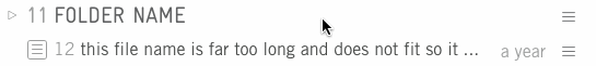
An example of Edit In Place is editing the file name within the document index:
Design notes
Elements used:
- Controls should be Minimal Icon Buttons, not Subtle buttons.
- Minimal buttons with a short text label may also be used if space permits.
- The editable region has a simple solid border in edit mode. The border is darker while the region has focus.
- If a non-form element is used during edit mode, all accessibility features must be reproduced including keyboard accessibility and a label announced to assistive technology.
When the user is not editing:
- If the content does not fit available space, it should be truncated.
- The edit icon must be revealed on hover and focus, to indicate to the user there is an editable region.
- The mimimum number of relevant controls should be revealed. For example, if the user can edit; only reveal edit and do not reveal the irrelevant 'close' control.
While editing:
- The Edit control must be replaced with both a Save and Cancel control. That is, the user must be able to either accept the change or cancel the action.
- Further controls such as Delete may be revealed along with Save and Cancel.
- The editable content's boundary box should be tightly matched to the content.
- If the content is larger than the available space, the editable content may be visually truncated. The input and controls should remain on a single line or row, do not push the controls to a new row.
- If the user presses enter while the editable region has focus, the change should be saved and the system focus moved to the Success indicator.
Saving changes:
- While the save action is in progress, show a Loading icon.
- Once the save action has completed successfully, show a green Save icon to inform the user. This icon should remain visible until further user interaction, or for a generious period of time before fading out.